你知道吗? 详细 >>
1. 灵敏度/检测限(detection limit)
“灵敏度”最初是一个统计学概念,表示样本中检测结果阳性数占所有阳性样品的比例。扩展到各个领域当中就成为各种机器或方法的性能指标,灵敏度越高,越能反应测定值的实际情况。在Western Blot试验中,如果要量化抗体检测的灵敏度就需要一个参数——抗体检测限(detection limit)。
2.抗体浓度
抗体浓度对于商品化抗体的影响有两方面。首先,较高浓度的抗体(>0.5mg/mL)通常性质更稳定,受生产工艺和成本控制等因素影响,不同品牌的抗体的浓度也不相同,所以购买时应注意比较;另外,经验不足的实验者往往被抗体的体积迷惑,然而相同质量下,低浓度的抗体体积更大所以,计算抗体性价比的时候应该考虑的因素是抗体的质量而非体积。
Analyzing gels and western blots with ImageJ
The following information is an updated version of a method for using ImageJ to analyze western blots from a now-deprecated older page. Don’t use the alternate methods discussed on the old page, as they are subject to way too much user bias.
A pdf copy of this page is available.
ImageJ (http://rsb.info.nih.gov/ij/index.html) can be used to compare the density (aka intensity) of bands on an agar gel or western blot. This tutorial assumes that you have carried your gel or blot through the visualization step, so that you have a digital image of your gel in .tif, .jpg, .png or other image formats (.tif would be the preferred format to retain the maximum amount of information in the original image). If you are scanning x-ray film on a flatbed scanner, make sure you use a scanner with the ability to scan transparencies (i.e. film). See the references at the end of this tutorial for a discussion of the various ways that you can screw this step up.
The method outlined here uses the Gel Analysis method outlined in the ImageJ documentation: Gel Analysis. You may prefer to use it instead of the methods I outline below. There should be very little difference between the results obtained from the various methods. This version of the tutorial was created using ImageJ 1.42q on a Windows 7 64-bit install.
1. Open the image file using File>Open in ImageJ.
2. The gel analysis routine requires the image to be a gray-scale image. The simplest method to convert to grayscale is to go to Image>Type>8-bit. Your image should look like Figure 1.

3. Choose the Rectangular Selections tool from the ImageJ toolbar. Draw a rectangle around the first lane. ImageJ assumes that your lanes run vertically (so individual bands are horizontal), so your rectangle should be tall and narrow to enclose a single lane. If you draw a rectangle that is short and wide, ImageJ will switch to assuming the lanes run horizontally (individual bands are vertical), leading to much confusion.

4. After drawing the rectangle over your first lane, press the 1 key or go to Analyze>Gels>Select First Lane to set the rectangle in place. The 1st lane will now be highlighted and have a 1 in the middle of it.
5. Use your mouse to click and hold in the middle of the rectangle on the 1st lane and drag it over to the next lane. You can also use the arrow keys to move the rectangle, though this is slower. Center the rectangle over the lane left-to-right, but don’t worry about lining it up perfectly on the same vertical axis. Image-J will automatically align the rectangle on the same vertical axis as the 1st rectangle in the next step.
6. Press 2 or go to Analyze>Gels>Select Next Lane to set the rectangle in place over the 2nd lane. A 2 will appear in the lane when the rectangle is placed.
7. Repeat Steps 5 + 6 for each subsequent lane on the gel, pressing 2 each time to set the rectangle in place (Figure 3).

8. After you have set the rectangle in place on the last lane (by pressing 2), press 3, or go to Analyze>Gels>Plot Lanes to draw a profile plot of each lane.

9. The profile plot represents the relative density of the contents of the rectangle over each lane. The rectangles are arranged top to bottom on the profile plot. In the example western blot image, the peaks in the profile plot (Figure 4) correspond to the dark bands in the original image (Figure 3). Because there were four lanes selected, there are four sections in the profile plot. Higher peaks represent darker bands. Wider peaks represent bands that cover a wider size range on the original gel.
10. Images of real gels or western blots will always have some background signal, so the peaks don’t reach down to the baseline of the profile plot. Figure 5 shows a peak from a real blot where there was some background noise, so the peak appears to float above the baseline of the profile plot. It will be necessary to close off the peak so that we can measure its size.

11. Choose the Straight Line selection tool from the ImageJ toolbar (Figure 6). For each peak you want to analyze in the profile plot, draw a line across the base of the peak to enclose the peak (Figure 5). This step requires some subjective judgment on your part to decide where the peak ends and the background noise begins.


12. Note that if you have many lanes highlighted, the later lanes will be hidden at the bottom of the profile plot window. To see these lanes, press and hold the space bar, and use the mouse to click and drag the profile plot upwards.
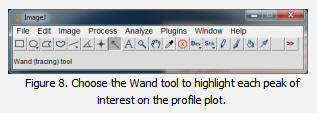
13. When each peak has been closed off at the base with the Straight Line selection tool, select the Wand tool from the ImageJ toolbar (Figure 8).

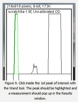
14. Using the spacebar and mouse, drag the profile plot back down until you are back at the first lane. With the Wand tool, click inside the peak (Figure 9). Repeat this for each peak as you go down the profile plot. For each peak that you highlight, measurements should pop up in the Results window that appears.

15. When all of the peaks have been highlighted, go to Analyze>Gels>Label Peaks. This labels each peak with its size, expressed as a percentage of the total size of all of the highlighted peaks.
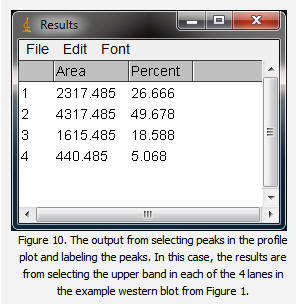
16. The values from the Results window (Figure 10) can be moved to a spreadsheet program by selecting Edit>Copy All in the Results window. Paste the values into a spreadsheet.

Note: If you accidentally click in the wrong place with the Wand, the program still records that clicked area as a peak, and it will factor into the total area used to calculate the percentage values. Obviously this will skew your results if you click in areas that aren’t peaks. If you do happen to click in the wrong place, simple go to Analyze>Gel>Label Peaks to plot the current results, which displays the incorrect values, but more importantly resets the counter for the Results window. Go back to the profile plot and begin clicking inside the peaks again, starting with the 1st peak of interest. The Results window should clear and begin showing your new values. When you’re sure you’ve click in all of the correct peaks without accidentally clicking in any wrong areas, you can go back to Analyze>Gels>Label Peaks and get the correct results.
编辑: helen
以下网友留言只代表网友个人观点,不代表网站观点

